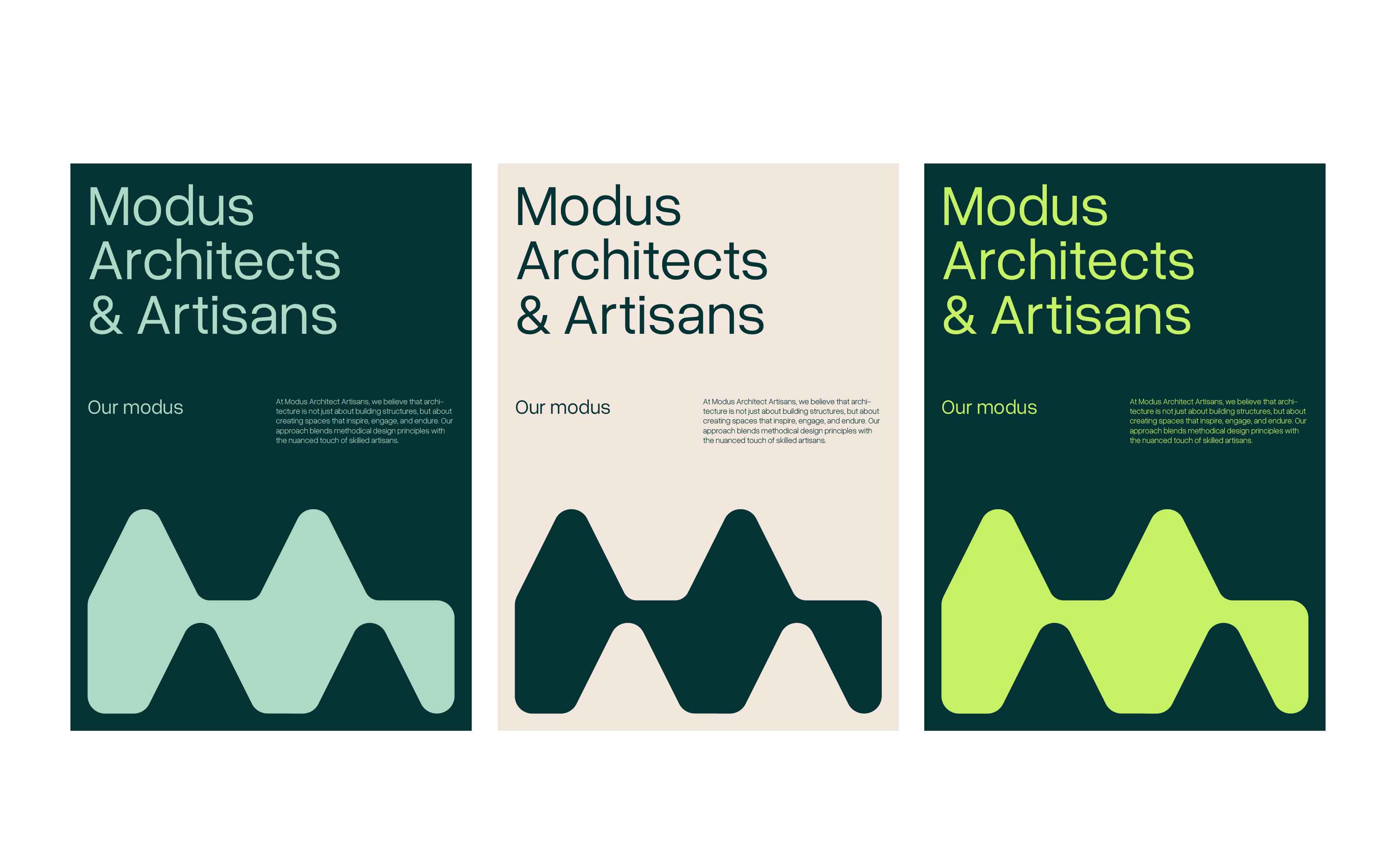
Primary Typography
Our primary typeface, Overused Grotesk, is chosen for its modern and clean lines, enhancing readability and offering a contemporary aesthetic that aligns with our architectural style. It’s used predominantly in all our major headings and body text to maintain a consistent and cohesive brand appearance.
Overused Grotesk
Overused Grotesk – Light
ABCDEFGHIJKLMNO-PQRSTUVWXYZ
abcdefghijklmno-pqrstuvwxyz
0123456789
!@#$%^&*
Overused Grotesk – Regular
ABCDEFGHIJKLMNO-PQRSTUVWXYZ
abcdefghijklmno-pqrstuvwxyz
0123456789
!@#$%^&*
Overused Grotesk – Semibold
ABCDEFGHIJKLMNO-PQRSTUVWXYZ
abcdefghijklmno-pqrstuvwxyz
0123456789
!@#$%^&*
Overused Grotesk – Bold
ABCDEFGHIJKLMNO-PQRSTUVWXYZ
abcdefghijklmno-pqrstuvwxyz
0123456789
!@#$%^&*